May 3rd 2020
Best Practices for Creating Banner Ads
Justin Nield, Senior Creative Technologist at Vungle Creative Labs, has been developing and testing hypotheses about the best practices for Banner ads. In the following Q&A, Director of Product Marketing, Tony Ouk, asked Justin to share what he and his team have learned, and how Publishers can achieve the most from their in-app Banner ads.
Tony: Before we jump into banner ads, tell us about Vungle Creative Labs and what they offer clients.
Justin: Sure! Vungle Creative Labs is dedicated to helping our clients create and adapt their ads. We have team members who work on creatives, those who develop the technology behind them, and others who analyze the data. We’re able to use this array of talent to optimize and improve our clients’ ad performance using data and a targeted, disciplined approach.
Tony: You’ve been interested in determining best practices for creating and optimizing Banner ads. What have you discovered?
Justin: Well, my team first started with analyzing industry best practices for Banner ads. For example, the industry recommends a variety of different file sizes ranging from an aggressive 15kb to a very generous 150kb. But in general, it’s recommended to keep the creative file size as light as possible. We also looked into font sizes and saw that the industry recommends that for legibility on devices, the font size should not be smaller than 16pt. Finally, the Banner creative should have a clearly visible, non-white 1-pixel border, or a dark or high contrast background color that distinguishes it from a site’s content.
Tony: Speaking of ad content, what kind of tips do you have for your clients?
Justin: I always tell clients to remember the 3C’s: compelling, concise, and clear. No one is persuaded by irrelevant, boring messaging; the goal is to evoke a reaction from the viewer. At the same time, with limited space, we have to keep it short and concise. It forces us to focus only on what we need to communicate. This also leads to the importance of being clear. Again, because Banner ads have such limited space, you want the user to know what to do; It’s vital to avoid any ambiguity.
Tony: What about the visuals? I imagine you also want to keep it simple.
Justin: Exactly. The more we worked with Banner ads, the more we saw an emerging theme: Less is More. This means a very simple design, strong imagery with clear, and eye-catching imagery. Also, we discovered that bright, bold, and solid colors perform best.
Tony: In your study of Banner ads, what has most surprised you?
Justin: We started out with a hypothesis that the more engaging the ad — think diverse imagery or animation — the better it would perform. However, what we discovered is that it’s about “Keeping It Simple.” We found that Banner ads with text only often performed exceptionally well. When we analyzed this further, it tied into what we were talking about earlier — text-only banner ads forced us to have direct, clear, and concise messaging.
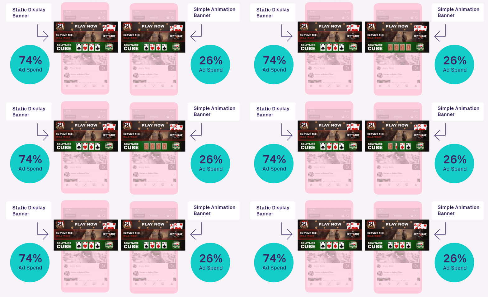
However, the biggest surprise came when we tested our hypothesis that adding simple animations to a banner ad would improve performance. The results were completely counterintuitive to what we expected. Adding simple animation to a Banner ad did not improve the performance! In fact, when we did an A/B test of one static and one simple animation banner ads, we saw that the static display banner outperformed the animated banner by more than three times! It really enforced the importance of Keeping It Simple.

Tony: Why do you think the static display Banner outperformed the animated Banner?
Justin: Well, if you think about it, a Banner ad resides in the actual content. It is a very short window of time when the user notices the ad before their focus shifts to the game. Having simple animations during this brief window only deters the end-user from the actual call to action. It’s almost like banner ads are an elevator pitch; you just don’t have time to get into too many details.
Lastly, if you take into consideration that a Banner ad only has a brief window to perform, it also means for most of the time the user isn’t even looking at the banner and doesn’t want to. Having animations in the banner can be distracting to the viewer, causing a less than optimal user experience. In creating a potentially poor user experience, this may even prevent that brief window from happening.
Tony: Thanks Justin. Before we end, are there other insights you and your team are working on?
Justin: We are continually looking for more ways to innovate within Banners. For example, we’re experimenting with click-to-expand Banners. With that, we are evaluating the feasibility of this capability and producing a concept to test this. We can then look at the data our test provides and analyze key insights from it. Another thing we’re looking into is breaking out and A/B testing other elements of the Banner ad. For example, asking the user a question versus suggesting a direction. That would be like asking the user, “Do You Like to Cook?” versus saying “Start Cooking Today!” Oh, and we’re are also researching the impact of imagery in the Banner. Stay tuned for more results!
